In today’s digital era, a mobile app presence is crucial for your organization’s success. So, now you have developed a robust, functional, and unique mobile app, yet you are not getting the popularity you deserve. Do you know the reason why? Well, there is a high scope that your mobile app is not user-friendly and can’t provide users with a delightful experience. Attracting users’ attention in a few seconds is really essential to get success in the competitive market.
When creating UI/UX design for your mobile app, you must ensure that it is simple and easy to use. Creating great UI/UX must be your main motto. So, want to learn the top essential UI/UX design principles for creating successful mobile apps? Let’s read our blog to get the details of UI/UX design principles.
Top 7 Essential UI/UX Design Principles For Creating Successful Mobile Apps
Creating effective user design means providing users with a smooth experience and making their mobile app development journey blissful. Let’s know the essential UI/UX design principles-
-
-
Your UI Design Must Be Simple
-
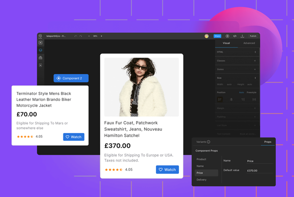
Generally, users download an app to get some services. You must insist on providing users with a great experience when they use your app. If we believe the report, the first impression of the app means a lot to a user. If you make your app complicated, they might uninstall your app and never install it again.
Here is the thing you need to do to make your UI design simple-
-
- You Must integrate universal navigation bars on each screen.
- Don’t hide essential information.
- Tell the users what they exactly need to do.
-
-
Ensure Your App is Free From Unnecessary Complexity
-
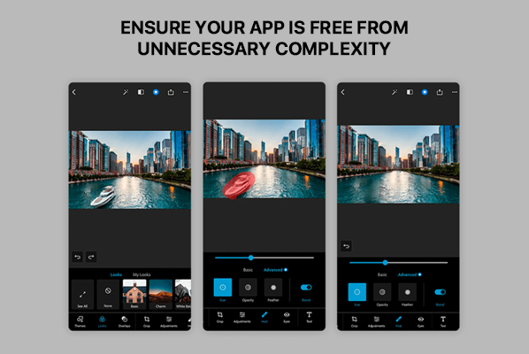
Another essential principle in the UI/UX design for mobile apps is keeping the app free from unnecessary complexity. You must try for as few screens and steps as possible at all times.
Additionally, ensure that your app must be organized in a proper and logical way. And most importantly, ensure your potential users don’t need to put the same information again and again.
-
-
Test Your Design
-
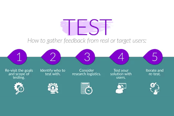
The testing process is one of the most important tasks in developing UI/UX design for your mobile app. You must test your mobile app repeatedly. Always try to test different features and layouts of your design to know what you should keep in your app and what not. Every time you test your app, you will get new ways to improve the UI/UX design of your app. When you get to know about your app’s problems in the beginning, you can fix them smoothly.
-
-
Hand Position Controls
-
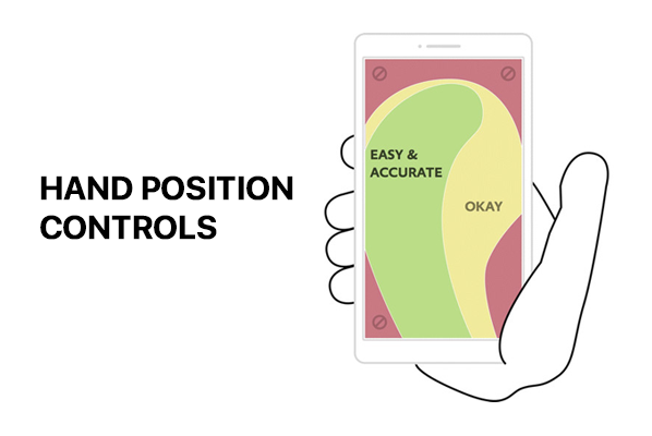
In the mobile app, the movement of your hand’s fingers is really crucial. If we believe the report, more than 50% of users use a mobile app with one thumb. So, you must consider the hand’s position while working on the mobile’s screen.
-
-
Loading Must Be Fast
-
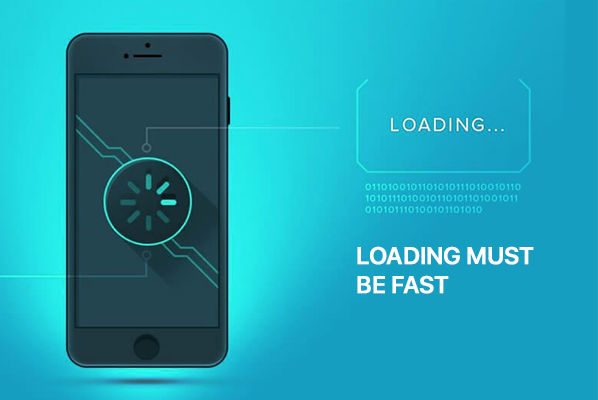
In today’s era, users are impatient, and they want every service instantly. Ensure your app can load super quickly without any effort. It is essential that your potential users can see when it’s loading. When users see a blank screen, they might think the app is not working.
Suggestion: Using simple loops to view the loading progress will work great. Also, Creating a simple and exciting loading animation will keep your potential users to stay in the app.
-
-
Get Users’ Feedback
-

No wonder every mobile app designer wants to provide users with a great design. You can ask users to give feedback about the app. The users’ feedback is extremely important as they are the ones who will use the app. The potential users’ feedback will help you greatly. You can know what will work for your app and what not. That’s how you can modify your app in a better way by knowing users’ suggestions.
-
-
Apply White Space
-
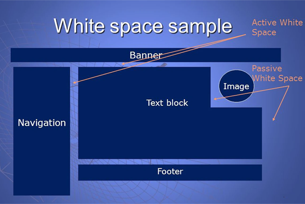
Applying white space to your mobile app is something that you can’t miss in your mobile app design. You can have a look on the Google Homepage, where they have beautifully used white space. Most mobile app designers don’t focus on using white space in their mobile app design. However, white space is really crucial as they serve two essential tasks:
-
- It makes your app look more clear and better.
- It helps users in clicking on the right direction.
That’s how white space makes the user experience more beautiful and smooth. So, you must use white space on your mobile app’s design.
Final Words-
No wonder a great UI/UX design can work magic on your mobile app. Here, we have shared the top seven essential UI/UX design principles for creating successful mobile apps. We hope these tricks will help you in getting the best UI/UX designs for your app. In today’s era, UI/UX design standards have risen significantly. Every user expects an amazing and smooth experience from a mobile app.
We are a top mobile app development service company with great UI/UX designers. We can help you get the best designs for your app. Let’s book your free appointment with Mobulous.
Contact Mobulous for App Development Solutions
Mail 


