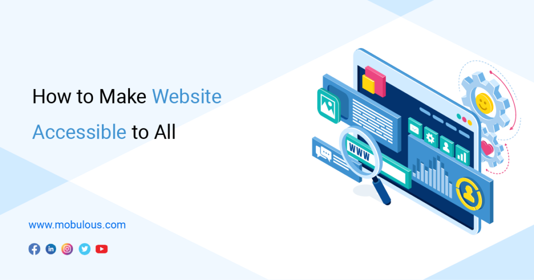
Today, the world has become more inclusive of people with disabilities. Humanity has consistently proven that whenever our societies are threatened by inconsistency or inequality, we come together and fight for what is right because we know it is the only way to shape a better future for our communities. Someone rightly said that the time is always right to do the right thing. Regarding website accessibility, doing the right means designing websites that work better for everyone so that people with diverse abilities can get equal access and equal opportunity. Accessibility, and web accessibility, are civil rights. People who are disabled should have equal rights to access websites to find services, information, and products on the web like everyone else.
However, government and non-governmental organizations are doing significant work to protect the rights of people with disabilities in the digital world. We can impact the world by taking responsibility for our actions and choices. So, this is the right time for every business owner, organization, agency, and developer to make websites as accessible as possible. It is a moral right and shows that you care for the community, regardless of ability. Designing web accessibility means that average users should also interact seamlessly with the platform. You can connect with iOS app development company to get engaging and user-friendly website.
How To Improve Web Design Accessibility
Site Is Keyboard Friendly- Keyboard accessibility plays a vital role in web accessibility. People with motor disabilities and some have tremors, which don’t allow them to fine muscle control. Hence, they only rely on a keyboard. Some people prefer to use modified keywords instead of using the traditional keyboard. And, if we talk about blind users, we also use a keyboard for navigation. The easiest way to navigate through the website is the TAB key. Using a TAB key will let people jump to the specific areas of the websites where options are displayed. Hence, you must ensure that all the listed options on the website can be easily accessed using the TAB key.
Choose Color Carefully- Remember that the color you choose can make or break your user’s experience because color contrast is something that really important in a design. It will help users read your text and clearly understand your content. Users can also easily differentiate between different sets of information. However, people suffering from color blindness can make finding information, call-to-action buttons, or other aspects challenging when your developers fail to use the right Color for the website. Additionally, the universal visual indicators are- green, which is for “GO,” and red for “STOP,” which can be lost entirely on users lacking the red-green Color. So, staying away from bright colors, like red, green, blue, and yellow combinations is important.
Choose The Best CMS That Supports Accessibility- When making a website, choose the right CMS (Content Management System) that supports web accessibility, like Drupal, WordPress, etc. Once you pick CMS that suits your needs, ensure that you choose the correct theme and templates that are accessible.
Turn Dynamic Text into Accessible Content- If you’re using embedding videos or gifs into your website, make sure that it should have captions and text alternatives for users with hearing or visual impairments. Apart from that, you can also use ARIA properties when content on a webpage is added or updated without refreshing the page. This will make sure that screen readers become aware of the new content.


