Blog designing is so much essential to be in the top blog builders list. A high-quality design plays a crucial role in a blog’s success. Beauty attracts attention like the same way good design attracts the attention of people. If your design is right, then users will spend more time on your blog, and if you look at the top blogs in any niche, you will find the blogs with good designs comes in the top and help the blog to stand out and be easily recognizable to visitors. Now, you know the importance of the blog.
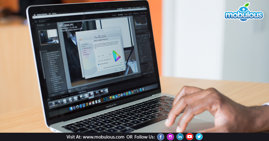
If you are not good at designing, then this article is definitely for you. In this article, I have written about some useful tips to create top-class blog graphics for the nongraphic designer.
Let’s have a look this tip helps you to be at the top.
Blog designing is not that tough as it might seem to you. It’s so easy to do. According to the survey, articles with relevant images get 94% more page views and 50% more shares.
Tips to create top-class blog graphics for the nongraphic designer
* Photoshop skills
You don’t need to have a masters in Photoshop. You need to know the essential Photoshop skills to create blog graphics. Following are the necessary Photoshop skill such as:
Essential tips to learn Photoshop skills:
1. Cropping, resizing, and selecting images, or part of images
2. Layers and how they function
3. Blending modes and layer blending options
4. Creating simple shapes such as circles, rounded rectangles, etc
5. Using the font tool
6. Importing and using patterns, brushes, and shapes
7. Using grids and guides to layout individual elements.
* Great color palette
You have noticed that the best design tend to have beautiful colors. For a great design, there is a unique need for brilliant colors. Now the biggest question is how to select the perfect color for your design? You can use sites like COLOURlovers, Coolors, adobe color, and so on. These sites help you to provide millions of beautiful color palettes.
* Keep it simple
Might you have heard beauty lies in simplicity? It’s the same with your design. Simple design attracts the attention of users. The more you create your design simple, the more it becomes attractive to users. So keep your blog design simple and don’t use more than three colors and three fonts.
* Good domain name
A great blog requires a great domain name. If you want your blog to be in the top, then you must buy your domain name. Make sure your domain name must be short, memorable, and most importantly, easy to spell so, that users can understand it. For a required domain name, you can try .blog or .agency.
* Use contrasting colors
You don’t need to use so many colors in your blogs as a beautiful design requires only limited colors. If you use so many colors, then there might be high chances of lousy conception. You must use only contrasting colors for your blog designs.
Read Also:
Services Provided by Mobulous to satisfy entrepreneurs, enterprises, & startups needs
Top 3 Questions to Ask when outsourcing app vendor
What are the factors that affect overall app development cost?
Access Our UI Case Studies: https://www.mobulous.com/blog/case-studies
Get in Touch with our Sales Team: sales@mobulous.com















Wow, this article is fastidious, my sister is analyzing these kinds of things,
so I am going to tell her. It’s such as you read my thoughts!
You appear to know so much approximately this like you wrote the ebook in it or something.
I think that you could do with a few percents to pressure the message home a bit, but instead of that, that is an excellent blog. An excellent read. I’ll certainly be back.
Hey there! Someone in my Myspace group shared this site with us so I came to take a look. I’m definitely loving the information. I’m bookmarking and will be tweeting this to my followers! Excellent blog and great design and style.
Hey just wanted to give you a quick heads up. The words in your
post seem to be running off the screen in Firefox. I’m not sure if this is a format issue or something to do
with browser compatibility but I thought I’d
post to let you know. The style and design look great though!
Hope you get the problem solved soon. Thanks
Comments are closed.